By Unimpressed UI Designer
Your Landing Page Roast 🔥
http://roblox.com
Design score
Design-quality weighted
Verdict
If this design were any more basic, it would be classified as a placeholder.
Where the design fails
Oh, what a shock, another landing page that seems to think a simple grid of images will secure user interest. How innovative.
spicyvisualDesignThis layout is as basic as it gets. It's not visually engaging; it’s just a collage. This wouldn't win a primary school art contest.
Fix
Maybe try something that isn't a glorified Pinterest board next time?

Ah, another victim of the dark mode fad. Because who doesn’t want their landing page looking like a black hole of creativity?
spicyvisualDesignThe excessive use of dark colors without any visually arresting elements makes this feel more like a void than an invitation to play.
Fix
Consider a color palette that actually engages users, rather than ominously inviting them to step into the abyss.

‘Sign Up and Start Having Fun!’ Ah yes, because nothing screams excitement like bog-standard typography.
mediumtypographyThe font choice is painfully generic, lacking any flair or personality. It’s sure to induce a coma.
Fix
Choose a font that at least tries to convey something unique. How about not picking your text from the ‘Basic Fonts For Dummies’ handbook?

The fine print is begging for some love. So many links, but all styled like they’re part of a high school project’s footer.
mediumtypographyYour choice of font here is about as exciting as watching paint dry. It lacks hierarchy and any semblance of flair.
Fix
Try a font that doesn't scream ‘I was the last choice.’ Maybe put some actual thought into this?

Look at that dull button color choice. Such a vibrant shade of ‘please forget me’.
mediumcolorThe button lacks any distinction against the background, making it blend in like a wallflower at a party.
Fix
Consider a color that actually pops—something that would catch the eye instead of dragging it down.

The color of that button is practically a neon sign of indecisiveness—who knew choosing hues could be this tragic?
mediumcolorWhile the contrast may be acceptable, the choice itself is dull and fails to invoke any urgency. It’s like a gentle nudge towards oblivion.
Fix
Maybe consider a color that actually inspires users to click, rather than make them question their life choices.

Did someone forget how to use padding? You’d think they were trying to shove content together like it’s a game of Tetris.
spicyspacingThe spacing is inconsistent and cramped; it conveys more anxiety than user-friendliness.
Fix
Space things out. Let your components breathe; a bit of white space never killed anyone.

Did whoever designed this think 'tight groping' was an acceptable spacing strategy?
spicyspacingComponents are crammed together, creating an unsettling sense of urgency as if everything’s fighting for attention in a claustrophobic space.
Fix
Embrace whitespace. Give everything some breathing room. Right now, it feels like a game of ‘who can step on each other's toes first.’
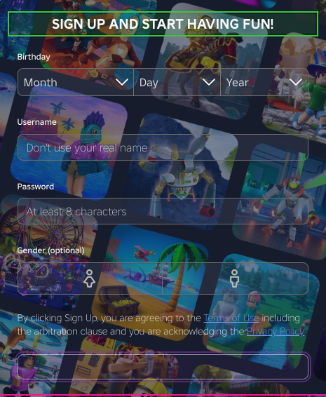
Ah yes, labels that go for a relaxed, no-limits approach to alignment. Because who needs consistency?
mediumconsistencySeeing labels in diverse positions screams ‘we don’t care,’ resulting in a chaotic UX.
Fix
Consistency is key. Align your labels like a disciplined army; chaos is only for toddlers.

The inconsistency in the header elements is giving me severe déjà vu—did anyone check if this was a copy-paste job?
mediumconsistencyDifferent font weights and styles across headers contribute to a disjointed user experience that fails to convey a cohesive brand voice.
Fix
Establish a style guide and stick to it. Unity is strength in design, not a chaotic array of mishmash.

Is it 2015 again? This looks like a relic of outdated design trends.
spicymodernityA lack of responsiveness and a static layout feels so last decade. It’s dated and uninspired.
Fix
Adopt a layout that speaks to modern design principles. Your users are not time travelers.

Oh, look, dead icons stuffed at the bottom. Such enthusiasm for a brand that's clearly just playing the repeats.
spicymodernityThese app store icons are so old-school that they might as well be fossilized. They lack interaction and modern styling.
Fix
Update these icons with a more contemporary look instead of whatever stale design trend you've dug out of the archives.

Design scorecard
| Metric | Score | |
|---|---|---|
| Visual Design | 30 | |
| Typography | 40 | |
| Color | 35 | |
| Spacing | 25 | |
| Consistency | 30 | |
| Modernity | 30 |
Design wins & fails
The choice of black background certainly leaves no one doubting it's dark mode.
There's a certain boldness in failing to use any modern design principles; it truly dares to be different.
The buttons take up space, which is impressive in a layout sense, even if it’s in the wrong way.
At least every banner has the same grim ambiance, creating a sense of relation amidst the chaos.
It’s comforting to witness such dedication to a color palette that insists on being neutral—like a design that refuses to take a stand.
The overused dark theme choices are practically begging to be dismissed as cliché.
Icons that look like they’ve come straight out of a nostalgia-fueled design manual have very little relevance.
The typography used is so bland it feels like it has all the personality of a damp sponge.
Consistency is clearly a suggestion, not a requirement, as every section feels like it was designed by a different team.
One can only chuckle at the amateur use of spacing, making you feel as though every element is vying for your attention inappropriately.