By Grumpy UX Designer
Your Landing Page Roast 🔥
https://aimfox.com/
UX score
UX-quality weighted
Verdict
This landing page is like a rollercoaster with no safety bar—thrillingly unpredictable and a bit risky!
Where the UX fails
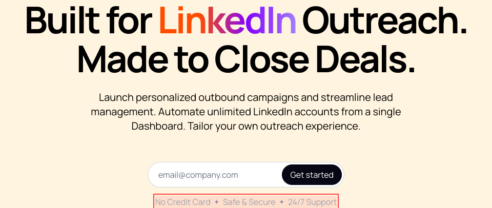
A 'launch personalized outbound campaigns' phrase that sounds like a poorly written ad. Can't we get a powerful, distinct statement here?
mediumnavigationThe navigation text lacks clarity and confidence. It feels more like a half-hearted attempt than a motivational driving force for the user.
Fix
Craft a concise, impactful message that excites users right off the bat.

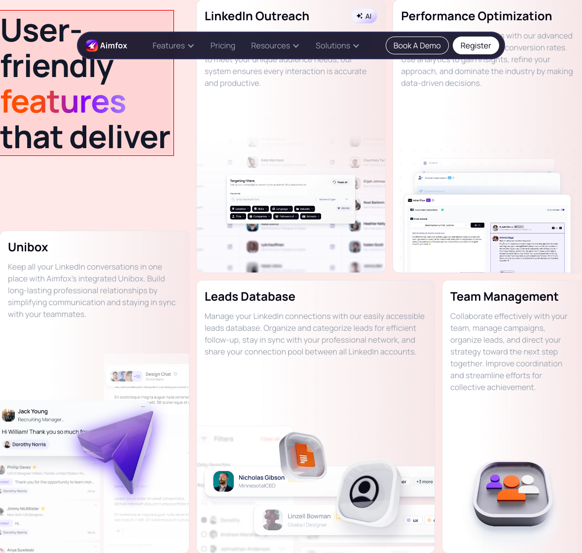
Oh look, we have a graph and an ocean of text that could drown a small village. Is this layout designed to engage or confuse?
spicynavigationThe visual hierarchy is a mess. Important data is hidden within a clutter of text, making it difficult for users to extract meaningful insights quickly.
Fix
Simplify the layout. Use clear sections and dedicated headings to guide users through important information without overwhelming them.
Your navigation is as clear as mud in a midnight rainstorm. Real smooth!
spicynavigationUsers are likely to feel lost in a sea of features with no clear path or hierarchy to guide them. What a fun way to ensure they leave puzzled!
Fix
Structure the page with clear categories and logical flow. What’s important should stand out so users can navigate without a map and compass!

Navigating this section feels like walking through a maze—unnecessary detours included.
mediumnavigationToo many layers in this section result in a convoluted experience. Each feature should be easy to access without hunting.
Fix
Re-evaluate the layout to present features in a more linear or logical arrangement.

Grid layouts are supposed to make things easier to digest, not turn my brain into mashed potatoes.
mediumnavigationThe grid feels overcrowded and lacks a logical flow, making it feel more like a game of Tetris gone wrong rather than an informative layout.
Fix
Consider reducing the number of items per grid section and use whitespace effectively to enhance readability.

Marquee? Really? Did I land in 2005? This isn't some retro website; we’re trying to engage users, not give them motion sickness!
spicynavigationThe automatic scrolling marquee distracts from the main message and degrades user experience due to annoyance and confusion.
Fix
Consider static design elements or a less aggressive animation that fits better with modern design aesthetics.
This FAQ section promises answers while providing nothing but uncertainties. Is it just me, or do I feel like I need a degree in cryptology to crack this subtle phrasing?
mediumnavigationThe current approach to questions is overly verbose and lacks clarity. Users want concise answers to their queries, not an essay on LinkedIn outreach.
Fix
Directly address the questions with short, straightforward answers; keep it punchy. Nobody has time for a story when they just want to know how to add their teammates.

Welcome to the 'what was the question again?' section. Because who doesn’t like a little game of hide-and-seek with the info they need?
mediumnavigationThe layout of the FAQ section doesn’t guide users effectively to the answers. People will have a hard time finding what they are looking for amidst the clutter.
Fix
Organize the FAQs with clear categories and better labels. Maybe a search bar? Just a thought!
This navigation seems like a wild goose chase. Am I supposed to find my way through the fog or use Google Maps?
mediumnavigationThere’s a lack of clear next steps or guidance in this section. Users want direction, not a puzzle, when trying to sign up or learn more.
Fix
Use more explicit calls to action or navigation items. Guide users gently to the next steps, so they don't feel like they’re wandering in the wilderness of your content.
Navigational elements are as misleading as a haunted house tour guide. Users shouldn't feel like they've taken a wrong turn on every click.
mediumnavigationThis section lacks clear paths for user navigation. Without guidance, users may end up in a rabbit hole, questioning their life choices.
Fix
Implement breadcrumbs or clear links to guide users through the process. Navigation shouldn't feel like solving a Rubik's cube blindfolded.

Is the font size meant for ants? I need a magnifying glass here!
mediumreadabilityThe font size is not accommodating for all users. Smaller text diminishes accessibility, making your site feel exclusive for no good reason.
Fix
Increase the font size and ensure that the line height is comfortable for reading on all devices.
Why, oh why, would anyone create such faded text? I can't tell if it's a callout or an apology.
mildreadabilityText that's too muted lacks the impact needed to draw attention. If you want to inform users, make it clear and compelling.
Fix
Increase contrast and make those callout messages pop. They should add value, not blend away into the background.
So, you really think this text color against this background is readable? I guess you like to keep your users guessing.
mediumreadabilityThe contrast ratio of the text against its background is likely too low for comfortable reading. This is not a fun treasure hunt; it's information people need.
Fix
Increase the contrast! Use a darker font color or a lighter background to ensure text legibility at a glance.

Oh joy, small gray text on a white background! Because who doesn't love squinting?
spicyreadabilityThe contrast between the text and the background is ridiculously low. This makes it uncomfortable and frustrating for users to read, leading to an immediate bounce.
Fix
You've got to step up your contrast game. Use darker text or more vibrant background colors, or else users will just scroll away to find something they can actually read.

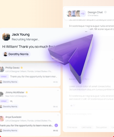
Oh, look! A section dedicated to user-friendly features. Too bad I'm struggling to find the 'user-friendly' part.
spicyreadabilityThe text appears crammed together, making it hard to read. Each feature could use more whitespace to breathe.
Fix
Increase padding and margin around text elements. Clearer separation will guide users' eyes better.

Congratulations on writing a novel—too bad it’s buried in a text block where no one would dare to read it.
mediumreadabilityThat paragraph is longer than most emails I get from my mom. Break it up or at least throw me a bone with bullet points for clarity.
Fix
Shorten the text and use bullet points to highlight key features for better scannability.

Wow, way to choose a title that screams, 'please ignore me!' Seriously, is it meant to be memorable or just drown in the sea of marketing jargon?
spicyreadabilityThe headline is buried under layers of fluff and color gradient that distract from the message. Simplicity should be your friend here.
Fix
How about just stating what you do clearly without the fanfare? Try something straightforward like 'Simple Integration Solutions for Aimfox'.

I've seen clearer instruction manuals for assembling IKEA furniture than this scattered mess of text.
spicyreadabilityThe text is crammed into small blocks, making it difficult to digest. Each paragraph should visually breathe to avoid overwhelming readers, especially in a tech context.
Fix
Implement better paragraph spacing and bullet points or short lists to make information more scannable.

Can we get a height adjustment for those lines? Reading this feels like trying to understand ancient hieroglyphs. What do you want me to do, decipher it?
mediumreadabilityThe text size and spacing make it difficult for users to read quickly, which is crucial in any FAQ section. The text appears cramped and uninviting.
Fix
Increase line spacing and perhaps slightly raise the font size for better readability.

The font looks like it’s on a diet—too thin and starving for attention. Does it need an IV drip of boldness?
mediumreadabilityThe text is difficult to read due to its thin weight, especially on a colorful background. Important information should leap off the page, not blend in.
Fix
Make the font bolder or increase size for better visibility. Let it shine, not shy away in a corner!

If I squint hard enough, I might decipher that header. It’s like you’re trying to initiate a game of 'guess what the text says.'
mediumreadabilityThe font weight for the heading text is too thin against the background, making it difficult to read at a glance. We want clarity, not a detective mission.
Fix
Increase the font weight or change the font color for better contrast against the background. Let it shine, not hide like it’s embarrassingly shy!
Oh great, another header that just wants to be 'artsy' instead of actually readable. Who needs clarity, right?
mediumreadabilityThe header blends into the background with poor contrast. The slick look is overshadowed by the fact that people can't even read it unless they're a hawk.
Fix
Increase contrast against the background or use a darker font. If your header is not legible, it's just a decorative squiggle.

You know, a 12-column grid sounds great... until you realize half of it disappears on mobile! Brilliant 'responsive' design.
mediumresponsivenessOn mobile devices, critical elements are compacted into a single column, which affects usability. Users shouldn't need a PhD to navigate on their phones!
Fix
Reassess your mobile layout. Ensure that essential actions are prominent and easy to interact with on smaller screens instead of getting squished into oblivion.
So this is what unresponsive design looks like? Fun little hide-and-seek happening between mobile and desktop views.
spicyresponsivenessElements are misplaced across different device sizes, making the experience a scavenger hunt instead of a smooth journey.
Fix
Implement a more robust responsive design strategy that checks for layout shifts on varying screen sizes.

Responsive design? More like a responsive disaster—it's like watching your content play hide-and-seek.
spicyresponsivenessThe grid system breaks down on smaller screens, making the layout feel cluttered and chaotic instead of elegant and streamlined.
Fix
Reassess the responsiveness. Make sure that your elements stack nicely on smaller screens and don't hide behind unnecessary breakpoints.
Trying to look good on desktop while pretending nothing's wrong on mobile, classic double life. Did you forget about your smallest visitors?
spicyresponsivenessThe current layout doesn't adapt well on smaller screens, making content potentially inaccessible or difficult to navigate.
Fix
Ensure the grid layout stacks properly on mobile to improve accessibility and user experience.
Ah yes, the beautiful struggle of finding the right size like Goldilocks. Currently, it’s neither too big nor small—just a right mess.
spicyresponsivenessSections are not responsive, making it hard for mobile users to navigate comfortably.
Fix
Make sure all grid items stack nicely on smaller screens. Mobile users deserve a good time too!

Oh look, more headings not aligned at all! This is about as organized as my sock drawer after laundry day.
mediumhierarchyHeadings fail to establish a clear hierarchy, making it hard for users to digest information and understand what matters most.
Fix
Use different heading levels appropriately. Maintain a visual narrative so users can easily skim and grasp important content without getting a headache.

This layout looks more like a scavenger hunt than a feature showcase. Where's the map?
spicyhierarchyThere's a lack of visual hierarchy—your users will be lost in your grid layout without clear paths to follow.
Fix
Implement a clearer grid structure and use color or size to establish hierarchy.

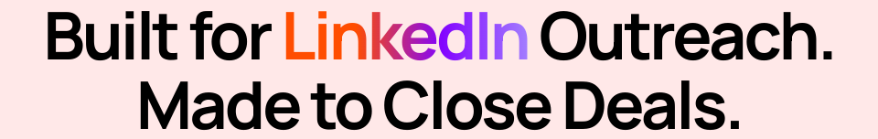
Wow, such a grandiose headline! Yet here I am, more confused by it than enlightened. Fanciful doesn’t mean functional.
spicyhierarchyThe main headline is full of buzzwords but doesn't clearly communicate the value proposition, leaving users scratching their heads.
Fix
Craft a clearer, more concise headline that directly conveys the core benefits of your offering.

Is this a landing page or a puzzle piece? I can't tell what's important when everything is screaming for attention.
spicyhierarchyThe current hierarchical structure does not prioritize elements, making it challenging for users to focus on what matters.
Fix
Establish a clearer visual hierarchy with prominent headers, well-spaced sections, and an orderly flow that guides the user’s journey.

Oh, a headline and a subheading! So original! Did you think that spacing them 1px apart would make any difference? It just reminds me of my grandma's knitting—tight, bunched up, and cluttered.
mediumhierarchyThe visual hierarchy here is lacking; the headline gets lost in competing whitespace. A clear distinction in size or weight could significantly improve readability and user engagement.
Fix
Make your headings visually distinct—think bold weights and larger sizes to lend gravity, not just more slack in your formatting.
More questions? After reading this FAQ, I don’t know whether to answer or book an appointment with my therapist.
mediumhierarchyThe layout lacks a clear hierarchy, making it difficult for users to prioritize which questions are most important.
Fix
Use bolder headings and make FAQs expandable/collapsible to create a cleaner, more organized appearance.
Is this a FAQ section or a riddle competition? Because I’m stumped and I didn’t sign up for mind games here.
mediumhierarchyThe layout lacks a clear visual hierarchy that helps users identify the most important information first.
Fix
Use larger headings and different colors for the questions versus answers to provide clarity.
Do I need to earn a Ph.D. in UX design just to understand this hierarchy? Because I’m struggling to find the most important points!
spicyhierarchyThe hierarchy is off balance; important information and actions are not given enough prominence. Users may miss out on key features or actions because they're not visually prioritized.
Fix
Increase the size or color contrast of primary headers and CTAs. Make them pop like popcorn in a microwave, so they can't be ignored!

So, we’ve got a mixed message here—are we presenting a powerful statement or just a blurry mess?
spicyhierarchyThe content hierarchy is poorly structured, causing key messages to compete for attention. Users won’t know what to focus on.
Fix
Adjust the hierarchy by emphasizing critical information through size and placement. Give your content a pep talk; it needs to be clear and focused!

Oh look, another button styling detail missed during your 3AM coffee run. Are we serious about hover states?
mediuminteractionThe lack of appropriate hover effects makes it unclear what is clickable, increasing user frustration. Standards exist for a reason!
Fix
Guys, just a simple hover effect to indicate interactiveness—make things clickable look clickable!
Clicking on this section feels like playing 'hide and seek'. Spoiler alert: users lose every time.
mediuminteractionMany interactive elements don’t provide any hover effects or visual cues. Users need feedback that says 'yes, you can click this!'
Fix
Add hover effects to interactive elements to guide users. If something's clickable, it should wink at them, not blend in with the wall.
Fancy animations, but what about basic functionality? Is this 'hover' or 'hopelessly lost'?
mediuminteractionWhile hover effects may look snazzy, they don't provide clear indications of interactivity. Users might not even realize that they can click anything.
Fix
Add a consistent hover effect for all interactive elements. If something can be clicked, make sure it screams, 'I’m interactive!'
Text centered—perfect! Now it's hard to focus on anything specific, like losing a game of hide and seek but with words.
mildinteractionCenter-aligned text can reduce readability and make it hard for users to track lines. It’s aesthetically pleasing in small doses, not for the main content.
Fix
Stick to left-aligned text for paragraphs. Reserve centered text for headings or titles where it can shine!
Hover effects! A delightful touch—except you've made them invisible for buttons. Fantastic strategy!
mediuminteractionButtons lack a consistent hover effect, leaving users unsure if they can interact with them. If nothing responds to hover, how do they know it's clickable?
Fix
Implement a hover state that changes the button’s appearance. Make it pop! Give them a reason to click without playing hide and seek.
A button labeled 'Learn more' that appears to be hiding in the shadows—what is it, a ninja?
mediuminteractionThe button is easy to miss against the white backgrounds and tiny text. Your calls to action should shout, not whisper.
Fix
Use contrasting colors for buttons. Ensure they're visually distinct from the backgrounds.

This is not a waiting room; users shouldn't have to wait to figure out if they can click something.
mildinteractionThe interactive elements blend too much with the background—it’s unclear what's clickable.
Fix
Add hover effects or distinct borders on interactive components to indicate clickability.
Button animations? Sweet, but they’re basically a circus act trying to distract from the fact that I still don't know what's going on here.
mediuminteractionYour buttons bounce around like they’re on a sugar rush, but the lack of clarity makes me feel like I'm watching a clown show instead of trying to interact with a product.
Fix
Focus on straightforward hover states and eliminate the gimmicky animations, making buttons clearer and more functional.

Oh, look! A button so shy it literally hid behind all your other content. Do you want users to interact or give them a treasure hunt?
mediuminteractionThe call-to-action button's positioning among busy elements makes it hard to find. Users might miss it entirely, resulting in lost conversions.
Fix
Give that button some space and visibility; center it or make it pop further from distracting elements.

Nothing screams credibility like a random gradient text to capture 'attention.' If only attention converted to sales, right?
mildinteractionThe use of gradient text is visually distracting and can detract from important messages, making it look more like a design trend than a branding element.
Fix
Stick to solid colors for your text. Complement your design program with shape and layout instead of distracting color shifts.
Oh look at you trying to get fancy with a 'hover effect.' Do you think a shadow will hide the fact that this button's call-to-action is buried under layers of mediocre design?
spicyinteractionThe hover effects are there, but they don't meaningfully change the button's appearance or communicate interactivity. Users might not even realize it's clickable.
Fix
Make the button pop visually. Consider changing the color and size on hover to show that it’s an interactive element.
A button that promises to get started but feels more like a casual invitation to your grandma's knitting club. Maybe break a sweat and spice it up?
spicyinteractionThe button lacks urgency and a clear call to action, which may fail to compel users to click.
Fix
Use more persuasive language like 'Start Your Free Trial Now!' to kick some excitement into action.

Confused? Don’t be! Tap on these questions and sink into a void of vague replies. Don’t you dare change your questions; the answers will haunt you.
spicyinteractionThe FAQ section isn’t structured well, leading to potential confusion or frustration when users click for answers that may lead them in circles.
Fix
Improve the quality of answers by being concise, and utilize a collapsible format so users can easily scan for questions of interest.

When viewing questions, my brain feels like it's in a traffic jam. How do you expect me to engage with this chaos?
mediuminteractionThe clickable items don’t have any hover effects, which leaves users unsure about whether the text is interactive or not.
Fix
Add hover states to these elements. It's 2023—not 2003! Help users know where to click!

Why does clicking feel like a workout? Because nothing seems responsive here. Am I supposed to be excited or just confused?
mediuminteractionThere are ambiguous elements that users expect to interact with but might not respond visually to a click. This can create a frustrating experience where users don’t know what's clickable.
Fix
Implement hover effects or visual cues to indicate interactivity. When something’s clickable, it should light up like a Christmas tree, not play dead!
Nice effort trying to hide your 'Get started' button under a pile of text. This isn't hide and seek—make it a centerpiece!
spicyconversionThe 'Get started' button is overshadowed by excessive text. Users should be able to spot the call-to-action immediately. Clutter isn't a design style; it's a roadblock.
Fix
Bring it front and center! Use contrasting colors and larger size to accentuate that button.
Hero? More like sidekick—because that CTA gets lost in the chaos.
spicyconversionYour call-to-action lacks distinction against the other elements on the page. It should be the focal point, not fading into the background.
Fix
Use a bolder color to make the button pop and contrast it with the background. One clear action over many muddled options!

Um, what is this call-to-action doing at the bottom of the section? It's like putting the dessert at the end of a traffic jam.
spicyconversionThe call-to-action button is not prominent enough in the hierarchical flow to entice users to click it. This is a recipe for missed interactions.
Fix
Position it strategically at the top or in a more eye-catching color. Make sure the button feels like the finale everyone wants to click!
'Get started'—immediately buried under a mountain of content. Genius move! Your users will likely get lost before finding it.
spicyconversionThe call-to-action is overshadowed by dense content around it, failing to draw attention when it should be the star of the show.
Fix
Make that button POP! Position it more prominently or change its color to steal the spotlight—after all, it deserves to be the headline act!

This is supposed to tempt me, but I can barely tell what 'Unibox' is without a subtitle. Is it a box? A planner? A fancy cat toy?
mediumconversionHeadings lack context and the accompanying text doesn't clarify what these features are aside from buzzwords.
Fix
Add a brief description under each heading to clarify what they offer and snag interest.

Oh, a 'Try Aimfox For Free' button? Because one button just wasn't enough chaos for this page.
spicyconversion'Try Aimfox For Free' competes for attention with 'Check out pricing' right next to it. Nice job making sure users are confused about whether they want to trial or pay.
Fix
Simplify the page—focus on one clear, enticing call-to-action that compels users to try the product.

You've got more fluff in these descriptions than in a cotton candy factory. Let's aim for substance over style, shall we?
mediumconversionThe descriptions are vague and filled with overused clichés, which could lead to user disenchantment instead of the encouraged action.
Fix
Get straight to the benefits, like how this makes the user's life easier or how they can save time and effort using your offering.

This button's call-to-action feels more like a polite suggestion than an invitation to change my life. 'Try Aimfox For Free'? C'mon, give me some enthusiasm!
mediumconversionThe CTA lacks urgency and excitement. It feels cookie-cutter and doesn't inspire the user to take immediate action.
Fix
Spice up that language! Use action-oriented phrases like 'Get Your Free Trial Now!' to create urgency.
Ah yes, 'Check Out Pricing'—the classic seller's cliffhanger. I hope that button has a parachute because it’s a little risky.
mediumconversionThe call to action comes across as vague and does not provoke an immediate sense of urgency to click.
Fix
Rephrase to something more action-driven like 'Discover Your Pricing Options Now!' to trigger excitement and urgency.
'Get started'? More like 'Get confused' with that sad little button. It’s giving me 'cruise control on a rollercoaster' vibes.
spicyconversionThe button lacks impact and urgency that could encourage users to take action. It needs to be more enticing than a bland sandwich.
Fix
Change the copy to something more engaging like 'Kick Off Your Journey!' Plus, make it a bit larger so it doesn't feel like an afterthought.

The button design screams 'I’m just a suggestion' rather than 'Tap me, I give you free stuff!'
spicyconversionThe call-to-action buttons lack sufficient visual prominence. If they were any more understated, they’d need a magnifying glass.
Fix
Make the buttons larger and vibrant. We need something that grabs attention, not an afterthought like yesterday’s leftovers.

Did we forget what a call-to-action looks like? This button's so shy; it won't even look at users.
spicyconversionThe button design fails to stand out against the chaotic background. If your call to action isn't screaming 'click me,' guess what? It's going to be ignored.
Fix
Give the button a brighter, bolder color or an outline to make it pop. Make it seem like it’s begging for attention, not hiding under a rock.
UX scorecard
| Metric | Score | |
|---|---|---|
| Navigation | 30 | |
| Readability | 40 | |
| Responsiveness | 50 | |
| Hierarchy | 25 | |
| Interaction | 35 | |
| Conversion | 30 |
Wins & fails
The color palette screams 'look at me!' but in a way that makes me want to look away.
The button sizes are big enough that even the clumsiest of users could click them.
There's a unique approach to layering content—too bad users feel like they’re under an avalanche.
The visuals are plentiful—the perfect distraction if you ignore the surrounding chaos!
Mobile responsiveness exists, though it’s more like a casual suggestion than a necessity.
The promise of '24/7 Support' makes me wonder who would be awake to answer these questions.
The 'No Credit Card' claim is like a siren call for all budget-conscious adventurers.
The heading structure resembles a game of Jenga—will it collapse under pressure?
Users may complete an expedition through your content and still have no clue what they need.
Too many CTAs in one area makes it feel like decision-making is a game show with a grand prize of confusion.
Your readability is challenged like an Olympic sport—who wants to struggle to read?
Visual design is so cluttered that even the words plead for independence!
The navigation is less a guide and more a treasure map—good luck finding the X!
The lack of content spacing means I might accidentally trigger a ‘content takeoff’ into orbit!