By Grumpy UX Designer
Your Landing Page Roast 🔥
https://postonce.to/
UX score
UX-quality weighted
Verdict
Visually clean and structurally modern, but currently playing it a little too safe. The design has solid foundations and responsive structure, yet suffers from low contrast, hidden navigation, and shy CTAs that whisper instead of sell. It feels like a polished MVP that’s afraid to fully commit to dominance
Where the UX fails
Ah yes, the hidden treasure trove of links, just waiting for someone to find them. Or not.
spicynavigationThe navigation is hidden on mobile, making it difficult for users to access important sections quickly. It's like playing hide-and-seek with your content.
Fix
Make the navigation visible on mobile. If the goal is to help users, hiding links seems a bit counterproductive.

Ah yes, the navigation options are brilliantly tucked away for the select few who can spot that elusive ‘hidden’ menu.
spicynavigationThe navigation is hidden on mobile devices, leaving users aimlessly scrolling like they're lost in the woods.
Fix
Make the navigation visible on all devices. Users need access to the information, not a treasure map!

Ah yes, because nothing says 'publish everywhere' quite like a giant gray text that makes someone feel like they're reading a history book.
mediumreadabilityThe contrast between the text color and background is suboptimal, making it hard to read at a glance. It lacks visual punch.
Fix
Boost the contrast by either darkening the background or lightening the text. A brighter or bolder shade could work wonders!

Oh look, another stunning display of 50 shades of gray. Who needs contrast when you can have this snooze fest?
mediumreadabilityThe contrast ratio is abysmally low, making the text hard to read. It’s like reading a ghost story in a fog.
Fix
Increase the contrast by either darkening the text or using a lighter background. Just give your users a fighting chance.

Looks like we took the spaced-out approach to a whole new level. Who knew accessibility could be enhanced with a giant no-no space?
mildinteractionThe spacing between related elements is excessive, creating confusion rather than clarity. It makes it feel disjointed.
Fix
Tighten up those gaps a bit. Cohesive grouping guides users better and improves the overall interaction experience.

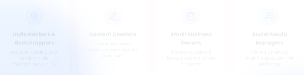
A grid layout? Groundbreaking! Too bad it's as clear as mud on how to navigate these diverging paths.
mediuminteractionThe grid is overcrowded with options without any clear differentiation in purpose or hierarchy, leaving users confused.
Fix
Add some spacing or visual hierarchy to make it clear what's what. Help users find their way without a map!
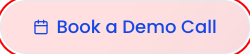
Because who wouldn't want to click on a button that blends in with the rest of the unremarkable interface?
mediumconversionThe call-to-action buttons are designed in a way that they do not catch the user's attention adequately, risking lower conversion rates.
Fix
Use bolder colors and larger fonts for call-to-action buttons to make them pop! They should stand out like a sore thumb on a beautiful backdrop.

Because what says 'Join us!' more than a button that could easily be mistaken for a backdrop in a sad play?
spicyconversionThe call-to-action buttons lack visual contrast against the background, risking lower conversion rates.
Fix
Use brighter colors and bolder text for your calls-to-action. They should stand out and scream 'Click me!'
UX scorecard
| Metric | Score | |
|---|---|---|
| Navigation | 50 | |
| Readability | 55 | |
| Responsiveness | 50 | |
| Hierarchy | 40 | |
| Interaction | 45 | |
| Conversion | 60 |
Wins & fails
Responsive layout adapts smoothly across breakpoints without collapsing into chaos.
Clear sectioning and grid usage show thoughtful structural planning rather than random stacking.
Consistent typography scale (text-4xl → text-6xl) creates predictable visual rhythm.
Modern utility-first styling keeps the interface clean and uncluttered.
Content hierarchy is present — it just needs more punch, not a complete rebuild.
Navigation literally disappears on mobile — because nothing boosts UX like hide-and-seek.
Low contrast headings give off ‘corporate annual report’ energy instead of high-conversion SaaS.
CTAs blend in like introverts at a networking event — technically present, emotionally invisible.
Grid sections feel crowded without strong hierarchy, forcing users to think too hard.
Excessive spacing between related elements makes components feel socially distant instead of cohesive.