By Grumpy UX Designer
Your Landing Page Roast 🔥
https://snowball.club/
UX score
UX-quality weighted
Verdict
This landing page is like a nice sweater—looks good but itches at the seams!
Where the UX fails
A hidden menu that appears only on larger screens! Nothing screams user-friendly like forcing your users to squint at their devices for a menu.
spicynavigationHiding important navigation elements on smaller screens frustrates users who may be looking for information quickly. Everyone isn't browsing on a 55-inch OLED.
Fix
Show these navigation options on all screen sizes to simplify access and improve user journey.

This layout screams, 'Get comfy, you're going to be here for a while.' Too bad it’s like mingling with an awkward relative at Thanksgiving.
mediumnavigationWhile centering content can be visually appealing, a total lack of direction here can confuse users. They might have a hard time finding what they want.
Fix
Organize content using a more structured layout that provides clear pathways for users to navigate their journey.
This isn’t some kind of magical image display; it looks like a sad attempt at avoiding the content.
mildnavigationPoor image placement can create confusion and make the layout feel scattered. If an image distracts or adds no value, why even include it?
Fix
Move the image to complement the content rather than compete with it or remove it altogether if it doesn’t add value.
It's like this section is asking us to gather around for a group hug, but we’re really just looking for information.
mediumnavigationCentering all the content can feel unstructured and lead to a lack of clear navigation paths for users. They need guidance, not a cozy huddle.
Fix
Use a more structured layout that guides the user’s eyes naturally through the information rather than leaving them guessing what's next.

Why does this layout feel like it’s waiting in line at a DMV? Where's the flow?
mediumnavigationA structure that invites users to easily navigate is essential. The current layout is cluttered and lacks smooth pathways to follow.
Fix
Reorganize this layout to create a logical flow that guides users easily from one action to another.

This section feels like I might fall into a black hole if I scroll down one more time. Can we have some context, please?
mediumnavigationLack of clear layout and context can make this feel uninviting. Users should feel guided through information, not like they stumbled into an abyss.
Fix
Create clear guidelines between sections with additional visual aids or break down content into digestible parts.
This feels like trying to find my way out of a corn maze—it's cozy, but I'm definitely lost in here.
mediumnavigationCentering all content can disorient users and make navigation feel like a chore instead of a smooth journey.
Fix
Provide a more structured layout that encourages fluid navigation through clearly defined sections.
This centralized layout is inviting if you want to get cozy with the content but not so much if you’re trying to navigate.
mildnavigationA centered layout can restrict users' natural navigation path, making it feel stagnant and disorganized.
Fix
Consider a more flexible layout that allows elements to breathe and enhance navigational flow.
Did someone order a word salad? Let's hope your audience has a PhD in jargon to decipher your message.
spicyreadabilityUsing convoluted phrases like 'monetize your X audience, FAST' comes off as overly flashy and potentially off-putting. Direct language is more engaging.
Fix
Simplify this text to communicate effectively. Conceptual clarity always trumps flashy language.
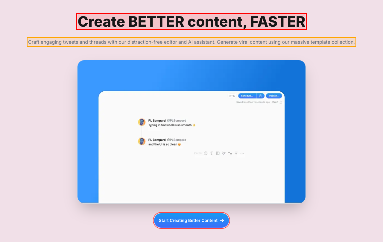
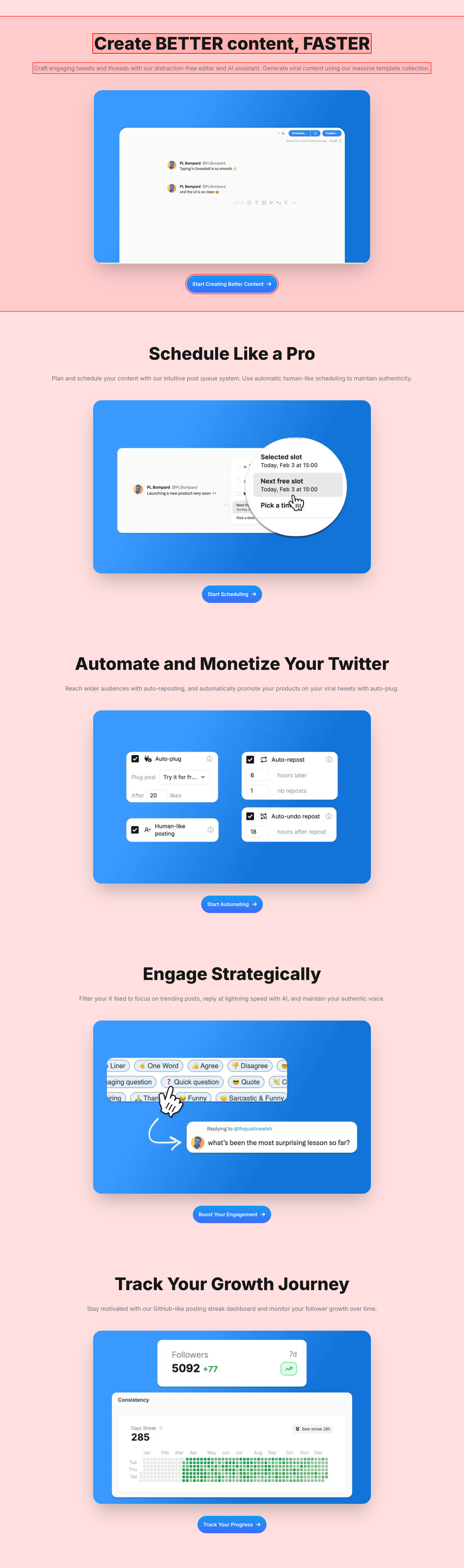
Oh, the irony of telling us to create BETTER content while you're yelling at us in ALL CAPS.
spicyreadabilityUsing all caps in headlines can seem aggressive and off-putting. It turns what should be an excited invitation into a desperate plea for attention.
Fix
Use sentence case to make it friendlier and approachable: 'Create better content, faster'.

Using ‘BETTER’ and ‘FASTER’ in ALL CAPS makes it feel like you’re yelling at the user. Calm down, it’s just content creation, not a fire drill.
spicyreadabilityAll caps text is seen as shouting. It can create an uncomfortable experience for users as they might feel they're being pressured instead of engaged.
Fix
Use sentence case to convey the message with less aggression: 'Create better content, faster'.

If all-caps aren’t shouting, I don’t know what is. You’re selling a service, not yelling it from a rooftop.
spicyreadabilityUsing all capital letters reduces readability and can feel aggressive, detracting from the engaging experience you're trying to create.
Fix
Change it to a friendlier sentence case: 'Automate and monetize your Twitter'.

Screaming 'Engage Strategically' in bold caps feels like being barked at by a drill sergeant.
spicyreadabilityThis aggressive tone can alienate users. They’re looking to engage, not comply with orders.
Fix
Change it to a friendlier tone, maybe something like 'Engage with Confidence'.

Using ‘Track Your Growth Journey’ as a title feels like a corporate seminar on personal development. Let’s not make users feel like they’re signing up for a gym membership.
spicyreadabilityThis phrasing might come off as dry and uninviting. Users resonate more with clear and relatable titles that are less formal.
Fix
Consider a more engaging title, like 'Monitor Your Growth Progress with Ease'.

Ah yes, ‘Join creators on the fast track to success’—such an inspirational buzzword soup! Who came up with this motivational seminar nonsense?
spicyreadabilityOverly formal and jargon-heavy language can alienate potential users. It can come off as insincere or cliché.
Fix
Simplify and make this more relatable. How about, 'Connect with creators and grow together'?

There's nothing quite like the feel of corporate jargon smothered with a side of self-importance—that's what this heading is serving.
mediumreadabilityPhrases like 'Join creators on the fast track to success' sound more like a bad motivational poster than an effective call to action.
Fix
Try to tone down the hyperbole and make it relatable. How about something simple like, 'Join fellow creators and grow your audience?'

Ah, the image placement strategy: let's make it a game of hide and seek! Spoiler: No one is winning.
spicyresponsivenessPoor image management can make your content look cramped or incomplete, leading to a negative first impression. Proper alignment and sizing is a must.
Fix
Ensure the visuals compliment the text rather than overwhelm it—opt for better alignment and responsive sizing for different devices.
This section could double as an eye test for people with bad vision; it’s almost whimsical how overwhelmed we feel by the hues.
spicyresponsivenessHigh levels of brightness and contrasting colors can make it hard for users to focus on the text and take action.
Fix
Calm down the background colors for a more balanced look that enhances readability rather than detracts from it.
This layout drops off into an abyss! It looks like it’s trying hard, but we just can’t see it.
mildresponsivenessPoorly aligned or oversized sections lead to confusion and lack of focus for users. It can create a disjointed experience that feels uninviting.
Fix
Ensure images and sections are well-spaced and appropriately sized to enhance clarity and the overall user journey.
Scrolling down feels like descending into the rabbit hole—let’s make sure it’s not a void of content.
mildresponsivenessIrregular or poorly sized sections hinder the user experience, leaving them uncertain about where to focus.
Fix
Ensure that sections are balanced and sized properly to provide a clean, organized experience across all devices.
This layout attempts to be cozy but ends up feeling like a cramped living room: great for a gathering, terrible for navigation.
mildresponsivenessToo much-centered content can hinder navigation and make it difficult for users to find essential actions or information quickly.
Fix
Consider a more structured layout that provides a logical flow and encourages seamless navigation.

Scrolling down feels like entering a black hole—who knows what might happen next?
spicyresponsivenessPoorly defined sections can make the user experience feel aimless and haphazard, leading to frustration.
Fix
Create logical visual breaks between sections to assist users in understanding the flow of content.
Why have one headline when you could have four? It's like trying to hold a conversation with someone who's shouting their life story instead of getting to the point.
mediumhierarchyThe lack of a clear content hierarchy makes it hard for users to know what they should focus on. Too many messages dilute your impact.
Fix
Consider a more structured approach to headlines and subheadlines to organize content effectively.

This list feels more crowded than a Friday night at a bar—remove some items and focus on what actually matters!
mediumhierarchyMultiplicity of points here can dilute the message, confusing users about what features are the most crucial.
Fix
Prioritize the most essential features to highlight first, and reduce the overall volume to maintain clarity.
Oh look, another 'Try it for free' button! Because having two buttons for the same action is totally necessary, right? Why not throw in a third while we’re at it?
mediuminteractionDuplicating the same call-to-action leads to confusion. Users should encounter a single clear action rather than multiple identical options distracting them from the main goal.
Fix
Consolidate these into one button that stands out, and make it evident that it's the main call to action.

Welcome to the land of endless instructions—where every line feels like a school assignment.
mildinteractionThe text feels overwhelming and verbose, which can deter users from engaging further. Simplicity is key in guiding users towards conversion.
Fix
Simplify this messaging. Consider bulleted points or shorter sentences that convey the value without overwhelming.

Oh look, another ‘Start Creating Better Content’ button! Because having two buttons for the same action is like having two forks on a single-serve meal—just unnecessary.
mediuminteractionMultiple identical calls-to-action clutter the page and overwhelm users. This can lead to confusion about which option they should choose.
Fix
Combine these CTAs into one strong action button to guide users clearly and confidently.

Ah yes, another 'Start Scheduling' button. Because users definitely need two different ways to be asked the same thing in less than two minutes.
mediuminteractionHaving multiple identical buttons creates clutter and decision fatigue. Users may feel compelled to click—and then they end up stuck in a loop of confusion.
Fix
Limit to a single, strongly worded CTA. Keep it clear and compelling, guiding users without overloading them.
Oh look, another 'Start Automating' button! For a second there, I thought I was getting a tax return.
mediuminteractionHaving multiple identical action prompts clutters the interface and causes decision fatigue—do users really need to be asked multiple times?
Fix
Consolidate this to one prominent button that's clear and compelling.

Hey look, another ‘Boost Your Engagement’ button! Guess what? Clicking it won't magically solve your engagement problems. Spoiler alert!
mediuminteractionHaving multiple identical CTAs not only clutters the interface but can also confuse users into thinking they might be missing something. This redundancy is a lazy design choice.
Fix
Streamline to a single, distinct call-to-action that doesn’t confuse users but rather directs them precisely.
This cozy layout you’ve arranged makes me feel like I’m in a too-huggy group therapy session.
mediuminteractionWhile centering content may feel inviting, it can also lead to overwhelming users with too much focus on one spot versus providing a holistic view.
Fix
Reorganize the layouts to create a more dynamic experience that highlights single points of interest without cramming them together.
This layout feels like I'm stuck in an awkward family photo—everyone's crammed in there, smiling too much.
mediuminteractionThe overly central alignment can make it overwhelming to process information, causing users to zone out instead of engaging.
Fix
Change this up by distributing content across the screen rather than forcing everything into the center.
Cancel anytime? More like 'cancel and make thousands of unsubscribe kids cry with regret'. This sounds more intimidating than inviting.
mediumconversionImposing language about cancellations creates anxiety rather than trust. Users should feel encouraged, not threatened, to engage.
Fix
Transform this to a more positive affirmation that encourages trial: 'You can cancel anytime, but we think you’ll love it!'
Yet another 'Start Creating Better Content' button! Because there's no such thing as too many CTAs, right? Said no user ever.
mediumconversionWhen multiple call-to-action buttons have similar wording, users experience decision fatigue and may end up doing nothing instead of clicking one clear path.
Fix
Consolidate to a single clear CTA, perhaps 'Start Creating Now!' and ensure it stands out.
The phrase 'Generate viral content' is like saying, 'Hey! Make it rain!' but forgetting to show how the rain machine works.
mediumconversionVague promises about generating viral content can lead to skepticism. Users want to know exactly how they can achieve that.
Fix
Be more specific about the features that lead to generating viral content in an easy-to-understand way.

So we’re talking about auto-reposting, huh? But it sounds like a one-way ticket to spam town instead of social media engagement.
mediumconversionUsing phrases like 'auto-reposting' without context can be off-putting as it might imply spammy behavior, which is a major turn-off for potential users.
Fix
Clarify the benefits and put a positive spin on it to make it feel more like engagement than annoyance.

Mentioning ‘automate’ and ‘plug’ together sounds more like a bad infomercial than an enticing product feature.
mediumconversionThe wording could create skepticism about the user experience. Users want clear benefits, not vague promises.
Fix
Refocus this to highlight the user benefits in a positive light without invoking thoughts of spam.

‘Automatically promote your products on your viral tweets’? Sounds more like a desperate attempt at a sale instead of genuine interaction. No one wants to feel like a target.
spicyconversionPhrases implying automated behavior can cause users to question the authenticity of their interactions, leading to hesitation.
Fix
Reframe this to emphasize real engagement, e.g., ‘Connect with your audience organically using our seamless sharing tools.’

Look at this! Another 'Track Your Progress' button that practically begs for attention. Is someone trying to qualify for the CTA Olympics?
mediumconversionRedundant calls to action confuse users, especially when they're all saying the same thing. Users don’t need to be berated with the same invitation multiple times.
Fix
Streamline to one actionable button per section for clarity, without overwhelming users.

Another shiny 'Start Automating' button! If I had a dime for every overly aggressive CTA, I could fund therapy for everyone who clicked it.
spicyconversionToo many CTAs can lead to decision fatigue. Users need clarity, not a gauntlet of buttons screaming to be pressed.
Fix
Consolidate to one clear action per section that expresses the main goal without overwhelming users.

UX scorecard
| Metric | Score | |
|---|---|---|
| Navigation | 60 | |
| Readability | 50 | |
| Responsiveness | 70 | |
| Hierarchy | 40 | |
| Interaction | 30 | |
| Conversion | 45 |
Wins & fails
The dominant cool colors are as refreshing as an ice-cold lemonade on a summer day!
The call-to-action buttons are bright and shiny—like a beacon for lost users!
There’s a plethora of content that gives users the illusion of choice—who doesn’t love options?
Using quirky phrases like 'monetize your audience' gives it that professional but playful vibe!
The layout is responsive, ensuring users can enjoy this eye candy on both mobile and desktop!
Too many buttons make this feel like a Game of Thrones episode—too many characters without a clear storyline!
The color contrast is about as exciting as watching paint dry—where's the pop?
Headline claims are lofty—if I wanted motivational speeches, I'd go to a TED Talk!
We've got navigational confusion thicker than grandma's gravy; it’s all over the place!
With a wall of text to read, your content is asking users to read a novel when they want a tweet!
The call to action is more like a request; if I'm convinced, I might click...maybe!
There's more clutter here than at a garage sale; time to declutter for clarity!