By Grumpy UX Designer
Your Landing Page Roast 🔥
https://youthconnect-colorlib.pages.dev
UX score
UX-quality weighted
Verdict
Summary is not yet available
Where the UX fails
Hidden navigation until you resize. Good luck on smaller screens; it's a game of hide and seek.
spicynavigationThis hidden portion is crucial for mobile users. Making it invisible by default does a disservice to your audience looking for quick access.
Fix
Consider adaptive designs that keep navigation visible on mobile devices, or implement a more user-friendly mobile menu.

Oh look, stats that seem to be taking a vacation at the bottom of the page. Good luck finding them!
mediumnavigationImportant content like stats should not be placed waaaaay down at the bottom where no one typically scrolls. This could lead to missed engagement.
Fix
Add these stats closer to the top of the page, perhaps right after the main message, to boost visibility.

This is navigation? Looks more like a group of friends deciding where to eat next.
mildnavigationHaving two different alignment styles for mobile and desktop can create a disjointed experience; it’s best to keep things consistent.
Fix
Opt for a more unified approach to navigation alignment, making sure users have the same experience regardless of device.

Confusing navigation styles: is this a menu or a casual meetup? Consistency is key!
mildnavigationThe navigation apparently can't decide on its layout, leading to a fractured user experience.
Fix
Standardize the layout to ensure a smooth navigation experience regardless of device type.

Is this a menu or an awkward family reunion? Look at all that wasted space!
mediumnavigationThe mobile version collapses but offers an awkward layout that doesn’t guide users effectively.
Fix
Use a sticky navigation or a burger menu that’s easy to access and keeps everything looking clean.

Ah yes, because everyone loves deciphering a cream-colored font on a dark background. So elegant...not!
spicyreadabilityThe contrast between the title 'RISE HIGHER' and the background makes it hard to read. It blends too much with the image, especially for users with any vision impairment.
Fix
Consider using a darker text color or adding a subtle shadow to enhance readability against varying backgrounds.

Wow, the 'RISE HIGHER' text is really slumming it with that nearly invisible gradient. Is it fading into the background or just embarrassed to be here?
spicyreadabilityThe gradient text effect blends too much with the background, making it practically unreadable. This is a major issue for users trying to understand what this section is about.
Fix
Use a solid color or adjust the gradient contrast to ensure it's legible against the background.

Oh wow, this 'RISE HIGHER' text is so delicate it might just float away! Someone get it a heavier background!
spicyreadabilityThe text blends too seamlessly with the background, losing its impact. This is a title, not a ghost.
Fix
Use a contrasting color or add a subtle shadow to ensure it stands out against the background.

Another lengthy paragraph? Come on, we don't need a novel here. Let’s keep it light.
spicyreadabilityThe passage is verbose, which could overwhelm or alienate users who just want quick, impactful information.
Fix
Trim the text down to something punchy and direct. It's a landing page, not a memoir!

This title looks like it’s trying too hard to blend in. Newsflash: it’s not working!
spicyreadabilityThe text blends with the background, making it difficult to read. Titles should grab attention, not play peekaboo.
Fix
Change the text color to something that actually pops against the background or add a shadow.

Longer paragraphs like this belong in novels, not landing pages. Chop chop!
spicyreadabilityThe length of this paragraph can turn users off. Keep it brief and compelling to maintain engagement.
Fix
Edit the text to make it concise and impactful. Bullet points can make it easier to digest.

The title is less of a bold proclamation and more of a quiet whisper. Can we get some volume, please?
spicyreadabilityThe title blends into the background too much. It needs to be more visually prominent to effectively capture users' attention.
Fix
Increase the contrast or add a shadow effect to make it stand out against the background.

Was this paragraph written for a novel? Because it’s dragging on longer than a Monday.
mediumreadabilityThe paragraph is too long and dense. Users tend to skim rather than read long blocks of text.
Fix
Break it down into shorter sentences or bullet points for easier digestion.

A lengthy, rambling subtitle that feels like it needs to go on a diet. Who has time to read a novel on a landing page?
mediumhierarchyThe sentence is too verbose for a landing page, potentially losing users' attention before they engage with the primary message.
Fix
Shorten this text to create a more immediate, impactful statement to keep users focused and engaged.

A badge that seems to have taken way too many breaks. Can it at least try to blend in with the section?
mildhierarchyThe badge design looks out of place and overly subtle in this vibrant layout. Instead of enhancing, it just confuses the user experience.
Fix
Consider redesigning the badge for a more striking appearance that matches the overall aesthetic better.

The 'I'm New' button looks like it took a nice long sauna before making its way onto the page. It struggles to stand out.
mediuminteractionThe button's subdued color scheme might cause it to be overlooked, especially among vibrant background elements, negatively impacting conversion.
Fix
Make it bolder or try a contrasting color that pops against the other visual elements.

The 'Join Us Wednesday' button looks like an afterthought. Did it fall in the washing machine? Because it’s struggling to stand out.
mediuminteractionWith the current design, the button doesn’t draw enough attention. Users may miss it entirely, reducing click-through rates.
Fix
Make the button larger or use a contrasting color that stands out more against the background.

This CTA wants to join the witness protection program, too shy to scream for attention.
mediuminteractionThe button blends into the background more than it should. It's crucial to catch the user's eye.
Fix
Make it bolder, and bigger, or choose a clashing color that truly stands out against its neighbors.

The 'Join Us Wednesday' button needs to be louder. Right now, it's more like a whisper in a library.
mediuminteractionThe button's color scheme makes it hard to differentiate from the background. Users might just scroll right past it.
Fix
Consider a brighter color that contrasts well with the background or enlarging the button.

The 'Become a Volunteer' button is the wallflower at the party—nobody notices it, and it’s definitely not getting any dance partners.
mediuminteractionThis button doesn't draw enough attention with its current design. It should pop more to encourage clicks.
Fix
Make it larger or change to a more vibrant color for better visibility and engagement.

Stats are great, but did we really need to give them a home at the bottom of the page? Because who doesn't want to scroll infinitely?
mediumconversionPlacing important stats that could motivate users below the fold may cause potential visitors to miss them entirely, diminishing click-through rates.
Fix
Relocate the stats to a more prominent area, perhaps right after the main message, to enhance visibility and encourage user engagement.

Is this paragraph a motivational speech or an epic novel? Either way, it’s losing the audience fast.
spicyconversionThe paragraph is too verbose. A landing page should have quick, digestible information, not a novella. Long texts can deter user engagement.
Fix
Edit the paragraph to be more concise. Aim for clarity and brevity to keep users engaged.

Oh great, just what I wanted to do: scroll all the way down to see stats. How quaint.
mediumconversionImportant values are tucked away at the bottom instead of being used to grab attention up top where they belong.
Fix
Place these enticing stats closer to the top to foster curiosity and engagement.

Great. Stats located at the bottom. Who doesn’t love playing 'find the information' while scrolling?
mediumconversionKey information should be prominent and easy to find, not hidden away at the bottom where it might be missed.
Fix
Move the stats upwards in the layout to make them more visible, ideally right after the title.
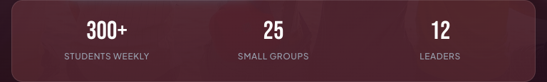
Hiding the important stats at the bottom like they're a dirty little secret? No thanks!
spicyconversionKey information like student statistics should be immediately visible to entice involvement, not banished to the footer.
Fix
Relocate these stats higher up on the page for better engagement and visibility.
UX scorecard
| Metric | Score | |
|---|---|---|
| Navigation | 0 | |
| Readability | 0 | |
| Responsiveness | 0 | |
| Hierarchy | 0 | |
| Interaction | 0 | |
| Conversion | 0 |
Wins & fails
No strengths or weaknesses listed for this audit.