By Grumpy UX Designer
Your Landing Page Roast 🔥
https://maneja.app/
UX score
UX-quality weighted
Verdict
This landing page serves more confusion than clarity, much like a map with the directions missing. Navigating through it feels like a game of hide and seek, but alas, the only thing hiding is effective content.
Where the UX fails
Ah, yes, the classic 'font size almost readable from the moon' approach. It's like you want people to squint at your brilliance.
spicyreadabilityThe headers are overly large, leading to a disconnect between the text and the image. This can overwhelm users and disrupt reading flow.
Fix
Consider reducing the font size for better hierarchy and improving readability.

Congrats, you've achieved peak irony! Claiming social growth is 'broken' while the text barely holds its own together.
spicyreadabilityThe phrase 'Social growth is broken' stands out like a sore thumb, drawing more attention than the entire message. It creates confusion more than clarity.
Fix
Change the wording to something more productive, like 'Social growth has challenges' to maintain a professional tone.

Meet Maneja, built to scale? More like built to squint! Did you choose the font size based on how far away I need to stand?
spicyreadabilityThe font size for headings is so large it distracts from the important content, making it hard for users to focus on what really matters.
Fix
Reduce the heading size and use less bold text to create a better visual hierarchy.

So this layout stays in the center like it's the main character in a soap opera? Can we have a little more flexibility?
mediumresponsivenessThe layout can look cramped on smaller screens due to poor spacing and alignment, leading to a frustrating user experience.
Fix
Implement spacing adjustments and fluid layout strategies to enhance mobile usability.

Another wall of text? On such a vibrant landing page? Are you trying to lull me to sleep?
mediumhierarchyThe paragraph is almost a novel length without subheadings or bullet points, drowning users in dull prose and making it easy to disengage.
Fix
Use bullet points or break it into short, digestible sections to quickly convey the value proposition.
That button saying 'Grow in 90 seconds' is sassier than it needs to be. What if I want to grow by just sitting and thinking?
mediuminteractionThe call-to-action is not aligned with user expectations and feels overly aggressive. Users might feel pressured to click without understanding the value.
Fix
Rephrase to something more inviting and less demanding, like 'Discover your growth potential in just a few steps.'

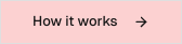
So you're telling me to 'How it works' without any clue? It's like saying, 'Here's a book without a cover.'
mediuminteractionThe link lacks context, making it unclear what 'How it works' entails. Users may feel hesitant to click as they don’t know what they're jumping into.
Fix
Add a brief popover or tooltip explaining what will happen if the user clicks — just enough to nudge their curiosity.
‘Get Started’? More like ‘Get Confused’! What am I starting? A growth journey or an existential crisis?
mediuminteractionThe call-to-action lacks context. Users need more information on what they'll get upon clicking.
Fix
Modify the CTA to specify what users get, like 'Launch Your Growth Journey Here!'

Asking me to 'Grow in 90 seconds'? Really? I can barely figure out what this AI does in 90 minutes!
spicyconversionThe call-to-action feels rushed and unrealistic, potentially creating distrust among users who want a deeper understanding.
Fix
Make the call-to-action more inviting by implying convenience rather than pressure, like 'Start your growth journey here.'

‘Maneja is not a content generator or a scheduler.’ Wow, how reassuring! It sounds more like you're trying to convince me it doesn’t bite.
mediumconversionThe phrasing is vague and could raise doubts. Users want clarity, not disclaimer-like statements.
Fix
Rephrase to positively emphasize benefits, such as, 'Maneja empowers your content strategy with AI assistance.'

UX scorecard
| Metric | Score | |
|---|---|---|
| Navigation | 60 | |
| Readability | 50 | |
| Responsiveness | 45 | |
| Hierarchy | 55 | |
| Interaction | 50 | |
| Conversion | 65 |
Wins & fails
The catchy header is like a shine that can guide a lost wanderer, though they'll likely be lost in a labyrinth soon after.
The color scheme tries its best, but it’s more like a neutral party that forgot to bring snacks to the meeting.
Strong branding potential aligns with the audience—too bad it's buried under a pile of text like a forgotten sandwich in a backpack.
There's a smidgen of enticing CTAs, like a mirage in a desert; too bad the surrounding landscape leaves much to be desired.
The readability? Let's just say it takes more effort than deciphering ancient hieroglyphics.
Navigation feels like running through a corn maze—you're in it, but you have no idea how to get out.
Responsiveness is about as flexible as a brick wall—good luck seeing this on mobile without a squint.
The conversion elements scream 'hurry up and click me!' but leave you wondering 'click for what exactly?'